Basic Shading using the Smudge, Blur, and Dodge/Burn tools (The GIMP)So you've just drawn a picture using the Gimp or scanned a picture in but it's lacking a little dimension. What you need is some shading :D. This tute is aimed to be easy and uses three of the most basic tools in gimp without any techno wizardry.
You can click the images to expand them and get a better view.1. In the beggining... Start with your drawing and roughly colour it in using different shades and tints of the same colour. Try and imagine where a light source or the sun will be. Then, colour in parts that will be touched by the light source a light colour. Colour the parts in shadow with a darker shade of the same colour. Anything inbetween can be coloured with a colour that is inbetween the dark and light colours.
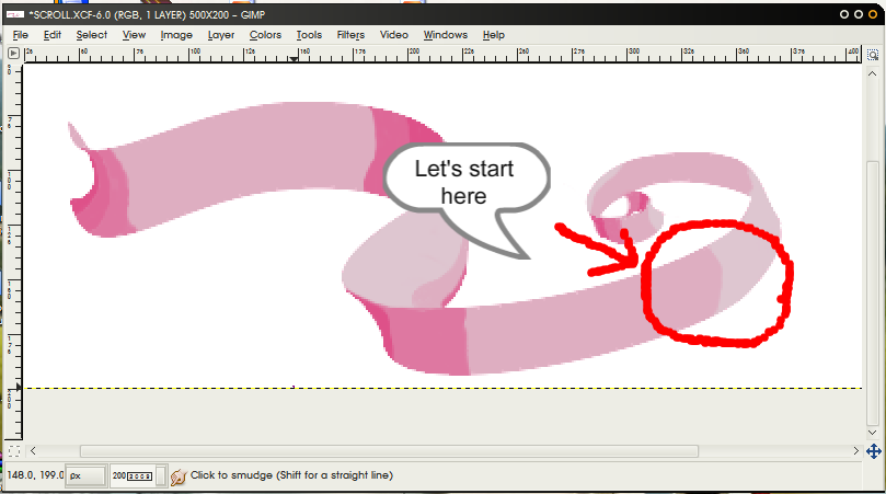
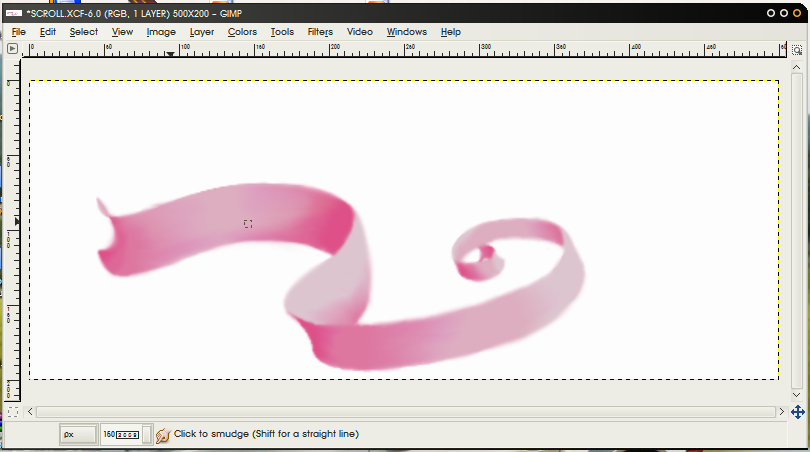
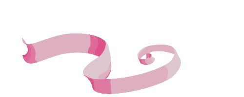
Here I have a simple ribbon that I have coloured in using the above method. You can save and open this in gimp if you want to follow along.
2. The Smudge ToolNext lets introduce ourselves with the
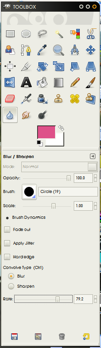
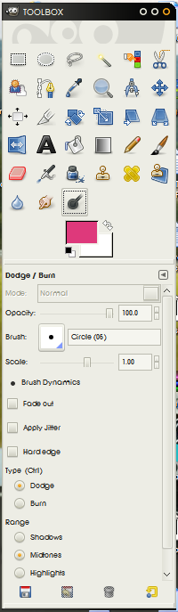
Smudge Tool. This is the one that looks like the hand with the pointed finger. I have
underlined the most important parts of the tool in the next image.
Opacity - changes how 'see through' the smudged colour will be. 1 is the highest value and will not be transparent at all. Anything lower than this will cause a lighter smudge.
Brush - choosing the right brush and it's size is very important. This will determine the shape and size of the smudge. Usually you wil be using a smaller brush to get into little spaces and a round brush helps get into corners and follow curves.
Fade Out - Fade out lets you choose a length of the stroke to help control how much you smudge.
Rate - Rate will determine how quickly something will smudge. A good guide to go on is
high rate will smudge more with less control and
low rate will smudge less with more control. This is just something you wil have to play around with to get a feel for what you need.
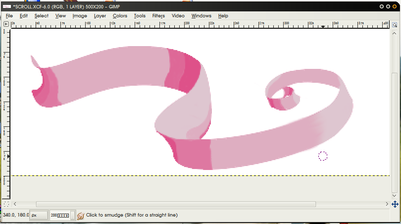
3. Smudging StuffNow let's smudge something :D
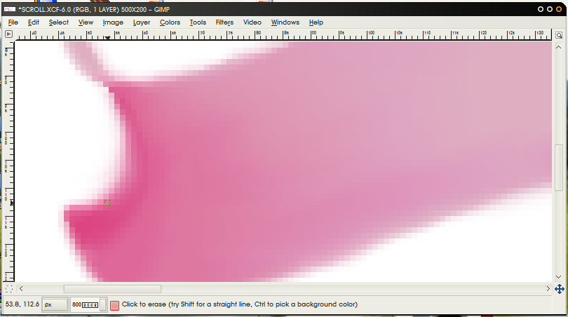
Using the smudge tool, make small strokes from right to left, from the lighter colour to the darker colour. The following image shows what will happen:
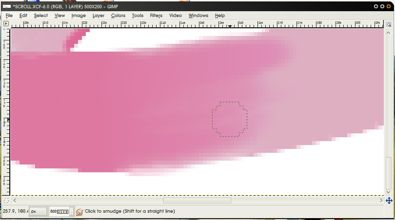
Now try going from dark to light. here is a close up
This is really a trial and error process but it will becaome easy with more practice. Remember you can use the undo button if you make a mistake and save your work when you are satisfied with what you have done.
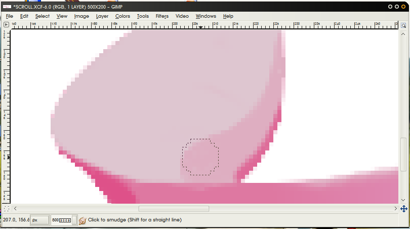
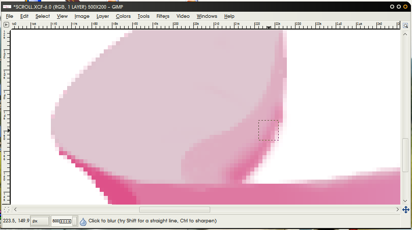
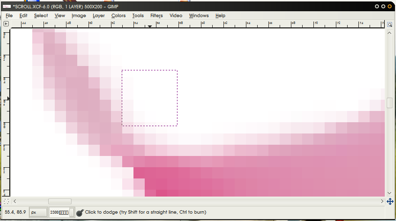
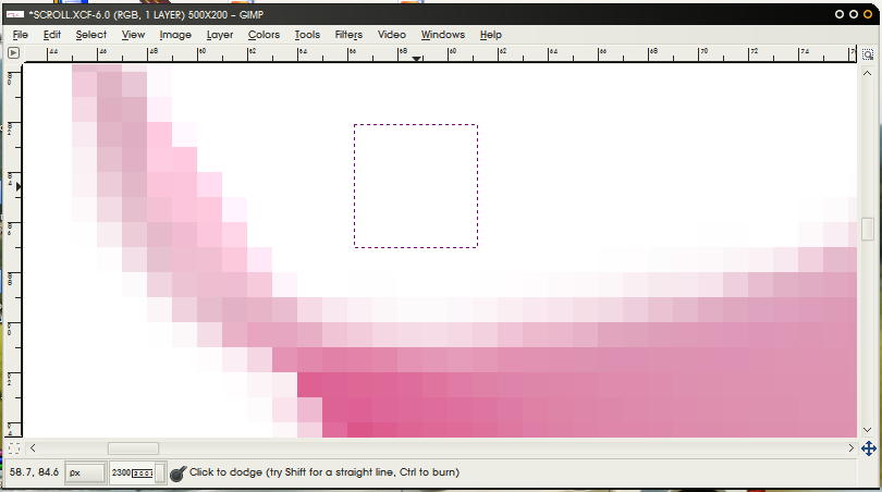
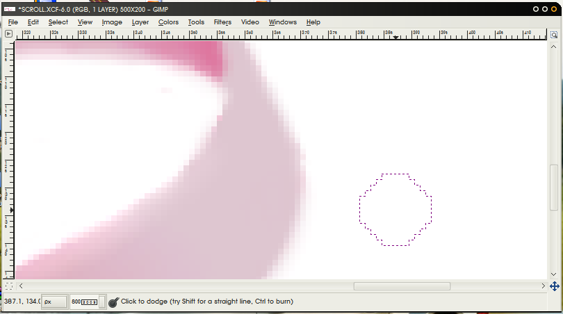
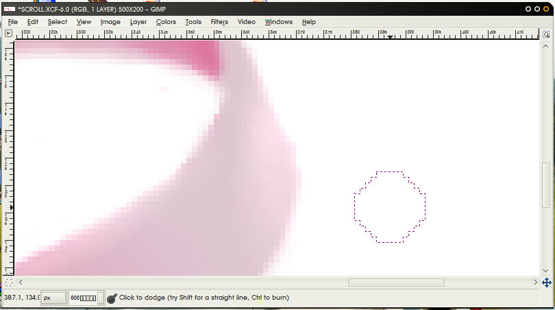
Try changing the rate and see how that works. Remember you are trying to get a smooth gradient from one colour to another. The next two images show where I have used a low rate and low opacity to smudge in a small area:
4. The Blur ToolSo you've been smudging around for a while now but it's you're not getting a nice smooth gradient yet. Introducing the the smudge tools sidekick Robin...I mean Blur tool ;D.
The Blur tool has similar options to the smudge tool but instead of pushing one colour into the next like the smudge tool, the Blur tool mixes the colours together.
There are two main uses for this tool:
-The first is smoothing out your smudges. Use a larger brush size and a mid to high rate then stroke along boundaries of two different colours. Avoid going over the edges or you will distort the shape of your work. Then use the smudge tool and smudge this a bit more and then blur again. repeating this gives ver smooth gradients between colours.
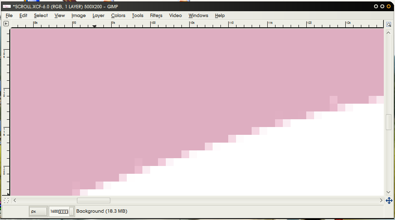
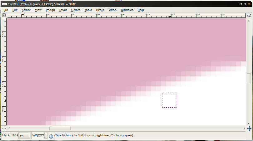
- You have some pixelation along an edge and want to blend it in slightly with the background. Use a small brush sze and a low rate. carefully go along the edge like in the following:
You might have something like the following image after all your smudging and bluring. But maybe you still think it looks a little flat...
5. Dodge and Burn toolNo, this isn't some moronic game with matches - this is adding some finishing touches.
Again, this tool has similar features to the others except instead of rate it is called exposure. This can be used in the same way as you have been using the rate tool though. The major differences are the dodge and burn options. Basically, the dodge option will lighten the colour and the burn tool will darken the colour. However, on light colours, choosing the dodge option then shadows or midtones will darken the colour by making the colour more grey.
You will most likely need to use the smudge/blur combo again to smooth out these changes.
Here is an example of the Dodge and highlight options (it's hard to see but the change is there :P)
On the very edge of the dark bit i have used the burn and shadow options:
Here is another dodge and highlight, a bit more noticeable this time:
6. FinitoFinally a comparison between what I started with and what I finished with. Not great, but I think it gets the idea across :).
I hope this was helpful in some way and not too long or boring - please give me feedback and suggestions on how I can improve this and ask any questions if you want to know more.


